
Tutorial 07
|
Tutorial 07 |
Graphing |
|
Graphing data and fitting curves |
|
 |
back to trigonometry |
on to advanced graphing |
 |
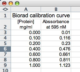 In
this tutorial on graphing, we will examine data taken from an experiment in
which the relationship between spectrophotometric absorbance at 595nm and protein
concentration is examined in order to produce a calibration curve. The data
is displayed in the screen shot to the right. Notice that the table is properly
titled as are the columns. For more information on formatting the data and displaying
the text see the previous tutorials.
In
this tutorial on graphing, we will examine data taken from an experiment in
which the relationship between spectrophotometric absorbance at 595nm and protein
concentration is examined in order to produce a calibration curve. The data
is displayed in the screen shot to the right. Notice that the table is properly
titled as are the columns. For more information on formatting the data and displaying
the text see the previous tutorials.
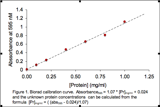
From this data we can write an equation for determining the protein concentration of an unknown solution from its absorbance in a Biorad assay.
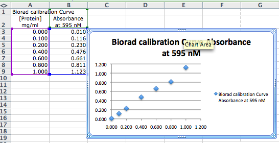
You need to know how to use Excel to plot data that you have entered (or calculated) in a worksheet. This appears to be a daunting task at first, but if you follow the steps below a few times it will become automatic, Let's plot the data table above

If you decide to print the graph as a new sheet, simply right-click (ctrl-click on a Mac) on the Chart Area, select MOVE CHART, and a window will open allowing you to set the chart in the current page, or into a new page.
If you know the functional relationship between your data (ie you can write
a formula relating x and y), you can make the computer draw the best-fit line
for that formula. You should add a trend line to a calibration graph or any
other graph for which you know (or have hypothesized) that the data fit a specific
mathematical relationship. You should not add a trend line unless
you already know (or have hypothesized) this relationship. If
you fit a trend line, you should also display the equation and the R-squared
value on the graph or better yet in the legend.
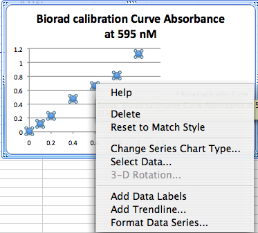
Beer's law tells us that there is a linear relationship between absorbtion and concentration in spectrophotometric assays. So the relationship between the data form a straight line in the form y = mx + b. To add the trend line, click on one of the data points on the graph to select them, then right click (CTL-click on Mac) to open a contextual menu, then select Add Trend line from the menu. Since we expect the fit to be linear, select linear fit from the type menu.
 |
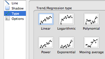 |
It is possible with Excel to add trend lines other than linear ones. For example, you may choose logarithmic, exponential, polynomial, power series, or a moving average, depending on the trend(s) displayed by the data.
It is also possible with Excel to add multiple trend lines to one set of data. For information on that technique see the tutorial on fitting multiple curves on one set of data.
To display the equation and R-squared value on the graph, click on the Options tab. Then place check marks in the appropriate boxes. When the OK button is pressed the best fit line is drawn and the equation of the line and R-squared value will be displayed on the graph. You may move the equation by clicking and dragging it to the desired location.
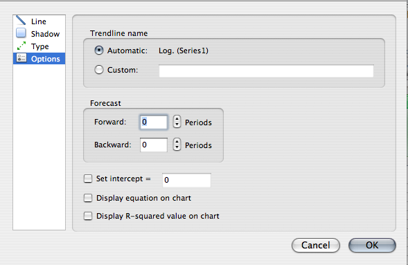
The R-squared value is actually the square of the correlation coefficient. The correlation coefficient, R, gives us a measure of the reliability of the linear relationship between the x and y values. A value of R = 1 indicates an exact linear relationship between x and y. Values of R close to 1 indicate excellent linear reliability. If the correlation coefficient is relatively far away from 1, the predictions based on the linear relationship, y = mx + b, will be less reliable. For more information about this topic, see the linear regression tutorial.
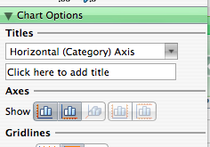
To display the axes labels, open the formatting palette and select chart options, and under the Titles heading, use the pull-down menu to select the Horizontal and Vertical axes, and insert a name in each text box.
You might find it odd that the equation displayed on the graph is y = 1.07x + 0.024 After all, we did not measure y's and x's, but rather we measured protein concentration and absorbance. You should always change the displayed equation to match your measured variables!
The final result of your efforts is a graph that looks something like the following:
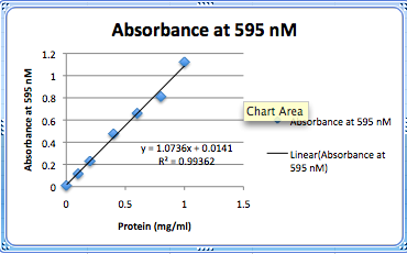
This is certainly adequate for your personal notes but it would not receive much credit if it were submitted as part of a lab report. Read the section of the style manual on graphs and adjust the appearance of your graphs to comply with it.
Note that it is also possible to change the font style and size of the titles and headings.Exel assumes that your graphs will be used for projected presentation and the default fonts are to large to look appropriate in a written report. If your graph is to be incorporated into a lab report it would be appropriate to change these to match the rest of the report. Simply right (control) click on a title or axis and select font. You can now change the font
The graph below illustrates a Biorad calibration curve that would receive full credit. The graph above with nearly the same information would only be worth about 75%. Formatting is important. Your figures and tables must comply with the Biology Department Style Manual.
Simply making the graph is not all that is required of a Biology student. Your real job t is to determine what Biology principles (if any) were verified by the laboratory experiment. You must constantly ask yourself: "What Biology principle was this experiment designed to show?" and "Did the experiment actually support the hypothesis being tested?"
Once again, ask your instructor if your graphs should be on separate pages or included with the data table as shown above or integrated into a formal report.
If your graphs look like this one and you format your tables to comply with the Style manual, you are guaranteed an A on your tables and graphs.
|
back to trigonometry |
 |
on to advanced graphing |
|
Copyright © 2000, St. Mary's College of Maryland. All Rights Reserved.
Please send comments, problems or request for topics to
Walter I. Hatch
wihatch@smcm.edu
August 11, 2005