 |
Tutorial 11 |
Linear regression and Excel |
|
Some advanced features of Excel linear regresion |
|
 |
back to statistics |
on to helpful hints |
 |
(See our Tutorial Page for more information about linear regression methods. You may also wish to take a look at how we analyzed actual experimental data using linear regression techniques.)
Sample data.
 Say we have a set of data,
  ,
shown at the left. If we have reason to believe that there exists a linear
relationship between the variables x and y, we can plot the
data and draw a "best-fit" straight line through the data. Of course,
this relationship is governed by the familiar equation
  .
We can then find the slope, m, and y-intercept, b, for
the data, which are shown in the figure below.

 Let's enter the above data into an Excel spread sheet, plot
the data, create a trend line and display its
slope, y-intercept and R-squared value. Recall that the R-squared value
is the square of the correlation coefficient. (Most statistical texts show
the correlation coefficient as "r", but Excel shows the
coefficient as "R". Whether you write is as r or R,
the correlation coefficient gives us a measure of the reliability of the
linear relationship between the x and y values. (Values close
to 1 indicate excellent linear reliability.))
Enter your data as we did in columns B and C. The reason for this is strictly cosmetic as you will soon see.
If we expect a set of data to have a linear correlation, it is not necessary
for us to plot the data in order to determine the constants m (slope)
and b (y-intercept) of the equation  .
Instead, we can apply a statistical treatment known as linear
regression to the data and determine these constants.
Given a set of data  with n data
points, the slope, y-intercept and correlation coefficient, r, can be
determined using the following:


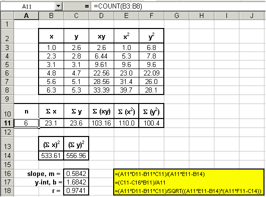
It may appear that the above equations are quite complicated, however upon inspection, we see that their components are nothing more than simple algebraic manipulations of the raw data. We can expand our spread sheet to include these components.

It is plain to see that the slope and y-intercept values that were calculated using linear regression techniques are identical to the values of the more familiar trendline from the graph in the first section; namely m = 0.5842 and b = 1.6842. In addition, Excel can be used to display the R-squared value. Again, R2 = r2. From the graph, we see that R2 = 0.9488. From our linear regression analysis, we find that r = 0.9741, therefore r2 = 0.9488, which is agrees with the graph.
You should now see that the Excel graphing routine uses linear regression to calculate the slope, y-intercept and correlation coefficient.
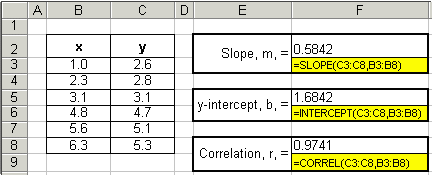
Excel has three built-in functions that allow for a third method for determining the slope, y-intercept, correlation coefficient, and R-squared values of a set of data. The functions are SLOPE(), INTERCEPT(), CORREL() and RSQ(), and are also covered in the statistics section of this tutorial.
The syntax for each are as follows:
Here is how we would analyze our data using these built-in Excel functions. Again, the equations for each calculation are highlighted in yellow.

So, to reiterate, we can determine the slope, y-intercept and correlation coefficient of any set of data using three Excel methods:
 |
back to statistics |
on to helpful hints |
 |
Copyright © 2000, St. Mary's College of Maryland. All Rights Reserved.
Please send comments, problems or request for topics to
Walter I. Hatch
wihatch@smcm.edu
August 11, 2005