
Tutorial 08
|
Tutorial 08 |
Advanced graphing |
|
Multiple series on on axis and special cases of adding trend lines |
|
 |
graphing |
on to advanced topics |
 |
 Let's
consider the example of an enzyme assay run at pH 4.0 and pH 4.2. In order to
compare the results we need to plot the results of both assays on the same graph.
Let's
consider the example of an enzyme assay run at pH 4.0 and pH 4.2. In order to
compare the results we need to plot the results of both assays on the same graph.
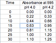
To the right are the absorbencies and time data for an enzyme assayed at two different pH's.
To plot both of these on the same graph, simply follow the Graphing Tutorial on the previous page, this time selecting all three columns as seen below.

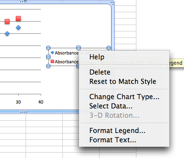
In the new Microsoft Excel, simply by including the data's heading in the selection to generate the graph, you have automatically included the legend in the graph itself. If you want to make any changes to the format of the graph's legend, right click (CTRL click on a Mac) and scroll down to the FORMAT LEGEND... option.
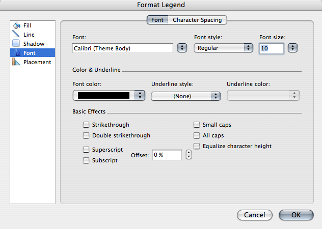
Now you can select from the options on the left and make changes to the font, and placement of the legend.
Lets continue with our enzyme problem. In an assay any assay of enzyme activity as a function of time, we can expect a linear relationship only as long as there is sufficient substrate to keep the enzyme functioning at its maximum rate. Sooner or later substrate will be consumed and the reaction will slow producing the curves shown here. As the enzyme activity is determined from the slope of the linear part of the line only we will obtain erroneous results from a trend line fit to the entire series.
Since there is no way to fit a trend line to a portion of a series we need to create two additional data series containing only the data from the linear part of each curve.
Look at the above graph and determine the range of the linear part of both data series. You will then have to create a new table omitting the non-linear portion of each series, then follow the instructions outlined above to generate and format the graph.
Adding error bars in Excel is easy. Here's how:

|
graphing |
 |
on to advanced topics |
|
Copyright © 2000, St. Mary's College of Maryland. All Rights Reserved.
Please send comments, problems or request for topics to
Walter I. Hatch
wihatch@smcm.edu
August 11, 2005