
 |
Tutorial 08 |
Advanced graphing |
|
Multiple series on on axis and special cases of adding trend lines |
|
 |
graphing |
on to advanced topics |
 |
 .Let's
consider the example of an enzyme assay run at pH 4.0 and pH 4.2. In order
to compare the results we need to plot the results of both
assays on the same graph.
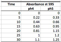
To the right are the absorbencies and time data for an enzyme assayed at two different pH's.
 To plot both of these on the same graph, first follow
the Graphing Tutorial on the previous page. This
will create the first data series to the graph.
Now open the Select Data Source menu and and add a series. Click add then enter a name for the series. The easiest way to accomplish this is to click the source data icon
To plot both of these on the same graph, first follow
the Graphing Tutorial on the previous page. This
will create the first data series to the graph.
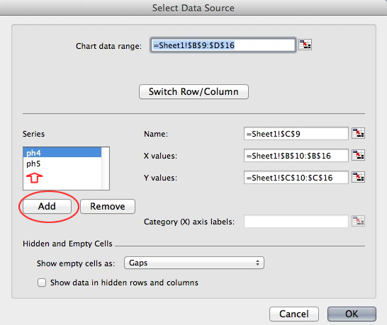
Now open the Select Data Source menu and and add a series. Click add then enter a name for the series. The easiest way to accomplish this is to click the source data icon![]() . This will open the select source data dialogue box. Now you can select the add series button. Series 2 will pop up on the series list. That's not a useful legend name so you can and either type the series name into the name box or better yet use the select data button
. This will open the select source data dialogue box. Now you can select the add series button. Series 2 will pop up on the series list. That's not a useful legend name so you can and either type the series name into the name box or better yet use the select data button ![]() to the right. This will bring you to back to the spreadsheet and you can simply select the column heading with the correct name ie pH2. Click the return icon to the right and your back in select data source. Now you can enter the data ranges for the data. Again the easiest way is to use the
to the right. This will bring you to back to the spreadsheet and you can simply select the column heading with the correct name ie pH2. Click the return icon to the right and your back in select data source. Now you can enter the data ranges for the data. Again the easiest way is to use the ![]() button to the right of the x and y values box. This opens the data sheet and allows you to highlight the values for the x axis. Again click the return icon to the right and your back. Do the same for same for the y axis.
button to the right of the x and y values box. This opens the data sheet and allows you to highlight the values for the x axis. Again click the return icon to the right and your back. Do the same for same for the y axis.
 Lazy? Can't remember all of that?
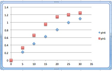
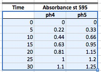 Simply select the column headings along with the data before you click on the scatter plot button. That's it! A graph opens with all of the series in place and the legend to the right as shown to the right. Remember this and it will save you a lot of time. Not to mention that you can now edit the legend labels by simply editing the column headings.
The
end result is a graph with a more descriptive legend and of course a better grade.
Note: A graph with Series labels in legends is not appropriate
in any biology
laboratory
Lets continue with our enzyme problem. In an assay any assay of enzyme activity as a function of time, we can expect a linear relationship only as long as there is sufficient substrate to keep the enzyme functioning at its maximum rate. Sooner or later substrate will be consumed and the reaction will slow producing the curves shown here. As the enzyme activity is determined from the slope of the linear part of the line only we will obtain erroneous results from a trend line fit to the entire series.
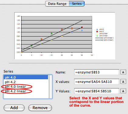
Since there is no way to fit a trend line to a portion of a series we need to create two additional data series containing only the data from the linear part of each curve.
How to get it done.
 In
the new window that pops up, Click "Add" and Series 2 will appear in the
series box. Now type the Name of
the data series in the text box (see the red circle in the image below).
and "Series1" changes
to to
read "pH
4.0". First,
look at the above graph and determine the range of the linear part of both
data series. In our example, the first additional series includes
data for pH 4.0 from
0
to 20 seconds,
and the second data series includes data from pH4.2 from 0 to 25 seconds.
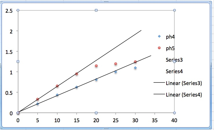 Now right-click on a data series and select the Add Trend
line option. (See figure below.) In this example we
will use a Linear Trend line and will display the
equation on the chart.
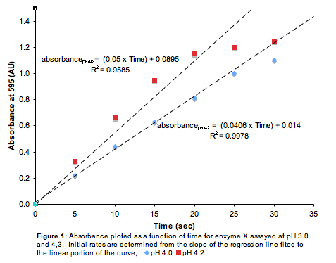
The graph is beginning to look appropriate for submission in a formal lab report, but it still lacks a text box with the formal legend and the default legend created by Excel contains superfluous information.
If
you wanted to impress everyone with a truly elegant figure Go on to "Legends"
in the "Chart Options" and select a bottom placement.
a guaranteed A for graphing. Of course it will help if the math is right.
In this example, we measure the protein concentration of three types of legumes. As in any proper data collection we will replicate our measurment We cant plot 100 replicates of each legume type on a graph so we will plot the average. Now we can compare the protein concentration visually.
TIn order to plot this data we need to determine the average protein concentration for each legume type. We can not, however, tell how much the data varies about this mean. Consider that the mean of 99,100, and 101 is 100. The mean of 0 100 and 200 also is 100. We need a way to demonstrate this dispersal of the data around the mean on our graph in order for our reader to interpret a comparison of the means. We need to plot a measure of variance. The customary indication of variance on graphs is the standard error of the mean (square root of the standard deviation) indicated by error bars..
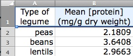 Consider the data to the right. In order to select a chart type you need to know what type of data it is. You should notice that there is no functional relationship between the kind of legume and its protein concentration. That is to say you cant write an equation expressing one as a function of the other so a scatter plot wont work. This is nominal or categorical data. The x axis is going to be a name or category (peas, beans or lentils) and a bar graph is the appropriate venue for plotting the data. Remember that MSWord uses the term column to mean bar. To graph this data select all of it (A1:B4) and select column from the chart ribbon.
 ![]() Select clustered column and the graph will appear.
Select clustered column and the graph will appear.
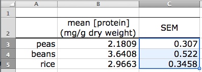 You will need to calculate the value for your error bars. This will be discussed in the statistics section but for our purposes these values are simply added to the data table as shown. The standard error of the mean for each data set is added to the right of the mean. It could be anywhere but this makes an attractive table and its easy to find when you need it.
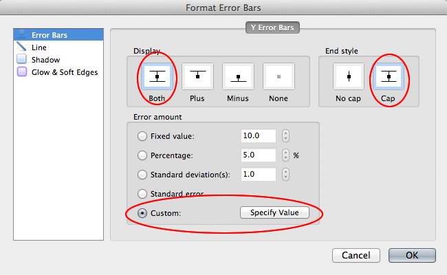 Clean it up as previously described and go to Error Bars
 ![]() on the chart lay out ribbon.
on the chart lay out ribbon. 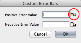 Remember the chart must be selected for this ribbon to show. From the error bars drop down menu select Error bars options and this dialog box will open. Select Both (up and down error bars) and select cap to produce a style manual compliant error bar. It appears as if there is appropriate choice (standard error) in the check menu below, but it will not calculate the values correctly. Select instead Custom. This will open the Custom Error Bars dialog box. Select the "back to the spreadsheet to find the value" button indicated next to the Positive Error Value box and select all of the SEMs (C3:C4) as indicated above. Return and do the same for the Negative Error Value box. Click ok and your done!
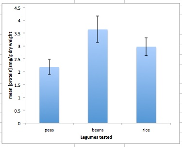
The end result is a data plot with error bars as shown to the right.
Error bars are equally appropriate on scatter plots where the data point represents a mean. The error bar still represents a measure of the variance about that mean.
Copy it into your lab report, add the legend and your your ready to move on to your 'Chemistry lab report. Remember that whenever error bars appear on one of your graphs, the legend must explain what they are. The customary wording is "Error bars represent ± one standard error of the mean" or "Error bars represent ± 1 SEM"
 |
graphing |
on to advanced topics |
 |
Copyright © 2000, St. Mary's College of Maryland. All Rights Reserved.
Please send comments, problems or request for topics to
Walter I. Hatch
wihatch@smcm.edu
August 11, 2005