
 |
Tutorial 07 |
Graphing |
|
Graphing data and fitting curves |
|
 |
back to trigonometry |
on to advanced graphing |
 |
 In
this tutorial on graphing, we will examine data taken from an experiment
in which the relationship between spectrophotometric absorbance at 595nm
and the concentration of phosphate measured is examined in order to produce a calibration curve.
The data is displayed in the screen
shot to the right. Notice that the table is properly titled as are the columns and that calculation cells are shaded
For more information on formatting the data and displaying the text see the
previous tutorials.
From this data we can write an equation for determining the protein concentration of an unknown solution from its absorbance in a phosphate assay. However we want to present the data graphically.
You need to know how to use Excel to plot data that you have entered (or calculated) in a worksheet. This appears to be a daunting task at first, but if you follow the steps below a few times it will become automatic, Let's plot the data table above. Enter your data onto a worksheet as shown in the above screen shot. If you pay attention to the title and column headings now, it will prevent confusion when you come back to the worksheet later. It will also save you time in statistical analysis as these titles so will automatically appear in statistical tables.
 First open the chart ribbon by clicking on the Charts tab. This will display the charts displayed below.
 Now from your data table, select the data you want to plot (A3:B6) in the table above. You can now select the graph type from the chart ribbon.
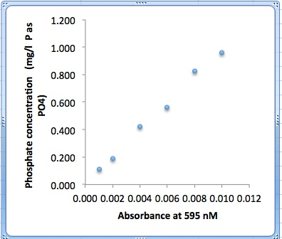
This is a calibration curve so the data are numeric and it requires a scatter plot. Click scatter plot and a submenu of scatter plot types appears. This is a calibration curve so you should select marked scatter it should have data points with out a line. A trend line will be fit to the points later. Hint: If you cant see the scatter plot button your excel window is to narrow. Grab the right edge and stretch it out until you can see the entire ribbon.
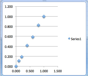 If you select your data range prior to selecting a chart type the Excel will create the chart with the data selected. As soon as you select a type, a crude graph will appear and you can drag it to a convenient location. Notice that as soon as you touch the graph you will notice that two chart sub menus pop up. Chart Layout and Format (chart) appear on the chart ribbon as indicated below. Click on Chart Layout. Note that the tab color changes to indicate that you have selected it. Now you have all of the important chart tools in front of you. The Chart title, Axis title, Legend, Axis, Grid lines, Trend lines, and Error Bars are all chart features you will need to manipulate to produce a style manual compliant graph. Ember that although it is optional on Power Point slides, lab report graphs do not have a title.
The Excel default graph is not exactly style manual compliment. You can see two, easy to fix problems immediately. Grid line are not compliant. These can be removed by hunting through the Chart Layout ribbon (shown below) for the Grid lines icon, selecting Horizontal grid line and the then No Grid lines, or you can simply click on one of the grid lines and press the delete key.
You will also notice that the default chart includes a legend to the right. As there is only one data series on this graph there is no need to distinguish it from others. Again you can hunt through the Chart Layout ribbon for the Legend icon, click it and select No Legend. Or you can click on the legend and again press the delete key
.
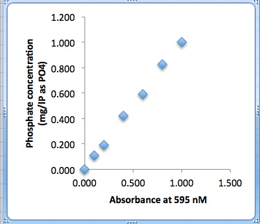
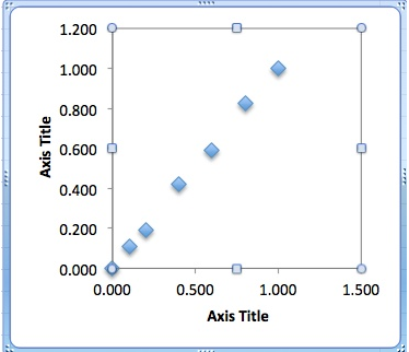 Now things look a bit more compliant, but, you are certainly not done. Both X and Y axis label are required.
![]() These are easily added from Axis Title menu in the Chart Layout ribbon. Select the Horizontal Axis title and click the Title Below Axis button shown here.
These are easily added from Axis Title menu in the Chart Layout ribbon. Select the Horizontal Axis title and click the Title Below Axis button shown here.
![]() Then from the Vertical Axis menu select the Rotated Title button.
Then from the Vertical Axis menu select the Rotated Title button.
These will open the axis title place holders (Axis Title) shone above. You only need to copy the titles from the data table and past them into the proper place holder. To gain access to the place holder editing function simply select the text box and hit enter. The cursor is now active with in the box
You can use the Copy and Paste functions from the Edit section of the Excel menu bar, but, you can use the copy keyboard command <Command C> and <Command V> keys to accomplish the same thing much faster. Just select the text and press command and either C or V simultaneously.
 Edit markers and line styles
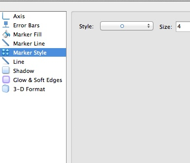
You may have notice that the markers are both a bit large and a bit ugly for inclusion in a lab report. Simply double clicking on the markers will open a Format Data Series dialog box as shown to the right. Here you can select a simpler marker style and and smaller size.
 As you can see I selected a simple circle at size 4. You could go on to edit the marker fill and line styles (outline) but simple is often best. Again you you are not trying to distinguish between data series here.
If your chart type contained lines, they would be edited with this same menu.
 Add trend lines
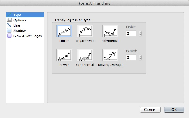
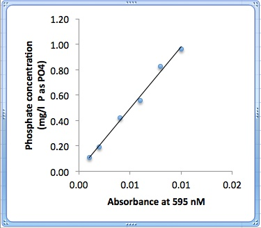
We still need to add the best fit linear regression (trend) line to the data. Beer's law tells us that there is a linear relationship between absorption and concentration in spectrophotometric assays . The expected relationship should form a straight line in the form y = mx + b so select linear. With this in mind select linear trend line and a trend line will appear. This control is on the chart format ribbon and clicking the Trendline button will drop down the selection list.
If need to modify the line in any way (unlikely), simply click on it and the Format Trend line dialog box will appear as shown below. Here you can change the regression type, the appearance of the line, and in the options tab you can select to include the equation and the R squared value. I think this data belongs in the legend below the graph for formal graphs, but, I often include them on informal (in excel nor word) for my own use. If you elect to put the equation on the graph for presentation, you should click on the text box and edit the equation so that x,y, and b are replace with their actual descriptions. In this case, Absorbance = (slope * [Phosphate]) + y intercept.
The R-squared value is actually the square of the correlation coefficient. The correlation coefficient, R, gives us a measure of the reliability of the linear relationship between the x and y values. A value of R = 1 indicates an exact linear relationship between x and y. Values of R close to 1 indicate excellent linear reliability. If the correlation coefficient is relatively far away from 1, the predictions based on the linear relationship, y = mx + b, will be less reliable. For more information about this topic, see the linear regression tutorial.
 Move charts to a new worksheet
You will discover that your work sheets get crowded with data tables making a suitable location for the chart difficult to find. An effective solution to this problem is to move the chart. This has the added benefit of allowing you to view your graph full screen.
Simply select the Chart and from the Excel Menu Bar then Chart Move from the drop down menu shown here. Select New Sheet then type in a brief description for the chart ie "P calib" click ok and your done. You can toggle back and forth by clicking the worksheet tabs.
If you decide to print the graph as a new sheet and wish to return to the data sheet, click on the Sheet 1 tab at the bottom of the spread sheet.
Occasionally you will be asked to submit an MSExcel file for evaluation. Simply save your file with a name that is compliment with the Biology Department file naming conventions and select file save.
A proper file name contains your last name your initials an underscore, a brief descriptive title and a version number. Consider this file. It would be saves as wihatch_phosphateCalibrationV1.exls.
Most of the time your tables and graphs will be submitted as part of a formal lab report or as part of a Power Point presentation. This version of Office (Office 11) finally makes this painless. All you need to do is select the graph by clicking on the blue border if its embedded in a work book or clicking on the graph tab if it has been moved to a separate work sheet. Now select copy from the edit drop down of the menu bar or (control C). Move to your word document and paste. Your done! Now you can size it or even move elements around from with in word.
Note that it is also possible to change the font style and size of the titles and headings. Excel assumes that your graphs will be used for projected presentation and the default fonts are to large to look appropriate in a written report. If your graph is to be incorporated into a lab report it would be appropriate to change these to match the rest of the report. Simply right (control) click on a title or axis and select font.
 |
back to trigonometry |
on to advanced graphing |
 |
Copyright © 2000, St. Mary's College of Maryland. All Rights Reserved.
Please send comments, problems or request for topics to
Walter I. Hatch
wihatch@smcm.edu
January 15, 2012